
A decision gets made in a thread on a Tuesday. Nobody files it. Three weeks later two people are building against opposite assumptions, and the only record that it ever happened is forty messages deep in a channel that has moved on.
SignalOps reads the places where work is actually discussed and produces the short document nobody has time to write: what was decided, what someone committed to, what is at risk, and which questions were asked and never answered. Every line traces back to the message it came from.
The product is three screens, and this page walks through all three. Signals is everything that was found. Report is the memo a manager reads instead of the channels. Map ranks the same problems by priority and lays them out on a calendar.
Every screenshot below is the running product, on an invented company called Northwind Robotics — its people, its channels and every message are made up. The report is a real one: the analysis was run for real and the memo was written by the model reading those invented messages, not by us. No customer workspace appears anywhere on this page.
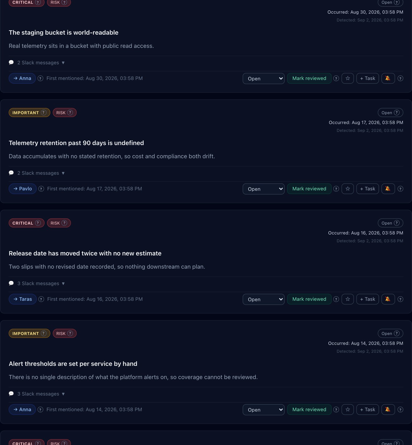
Signals — five kinds of thing, and nothing else
SignalOps does not summarise. It extracts five categories — decision, action, risk, question and gap — and refuses to produce anything else. The narrowness is the product: a tool that summarises everything hands you a second thing to read, while one that extracts five things hands you something to act on.
The tab opens on needs you rather than on everything, because a list that opens on 400 items is a list nobody opens twice. From there it filters by kind, by owner, by severity, or down to the two states a manager actually chases — the ones that keep recurring and the ones that were fixed and came back. It sorts by priority, it searches, and it exports the filtered list to JSON or CSV, because the answer to "our board wants this in a spreadsheet" should not be a screenshot.
- An item has an identity that survives runs
- Every extracted thing gets a canonical key, so the same risk found in four different weekly runs is one item seen four times rather than four items. That is what the RECURRING badge counts — "came up on 3 separate days" is a fact you can check against the messages, not an impression.
- Regressions are a separate state
- An item that was resolved and came back is tracked distinctly from one that has simply persisted, and carries its own REOPENED badge. They mean different things to a manager and would be invisible if both were just "open".
- Every card links to its source
- Each signal stores references to the exact messages it was derived from, resolved against an archive of everything ever read, and the card expands to show them. A summary you cannot verify is one you stop trusting the first time it is subtly wrong.
- Occurred and detected are different columns
- The card prints when the conversation happened and, separately, when the analysis found it. Collapsing the two would let a slow run make an old problem look new.
- Muting is a first-class state
- A signal you have decided not to care about is muted rather than deleted, so the next run does not resurrect it as new — and the decision to ignore it stays visible instead of being repeated silently every week.
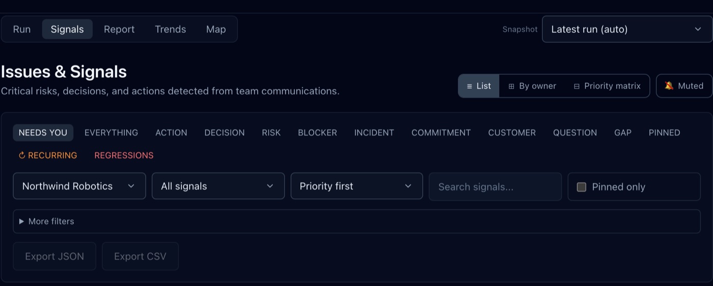
Report — the memo you read instead of the channels
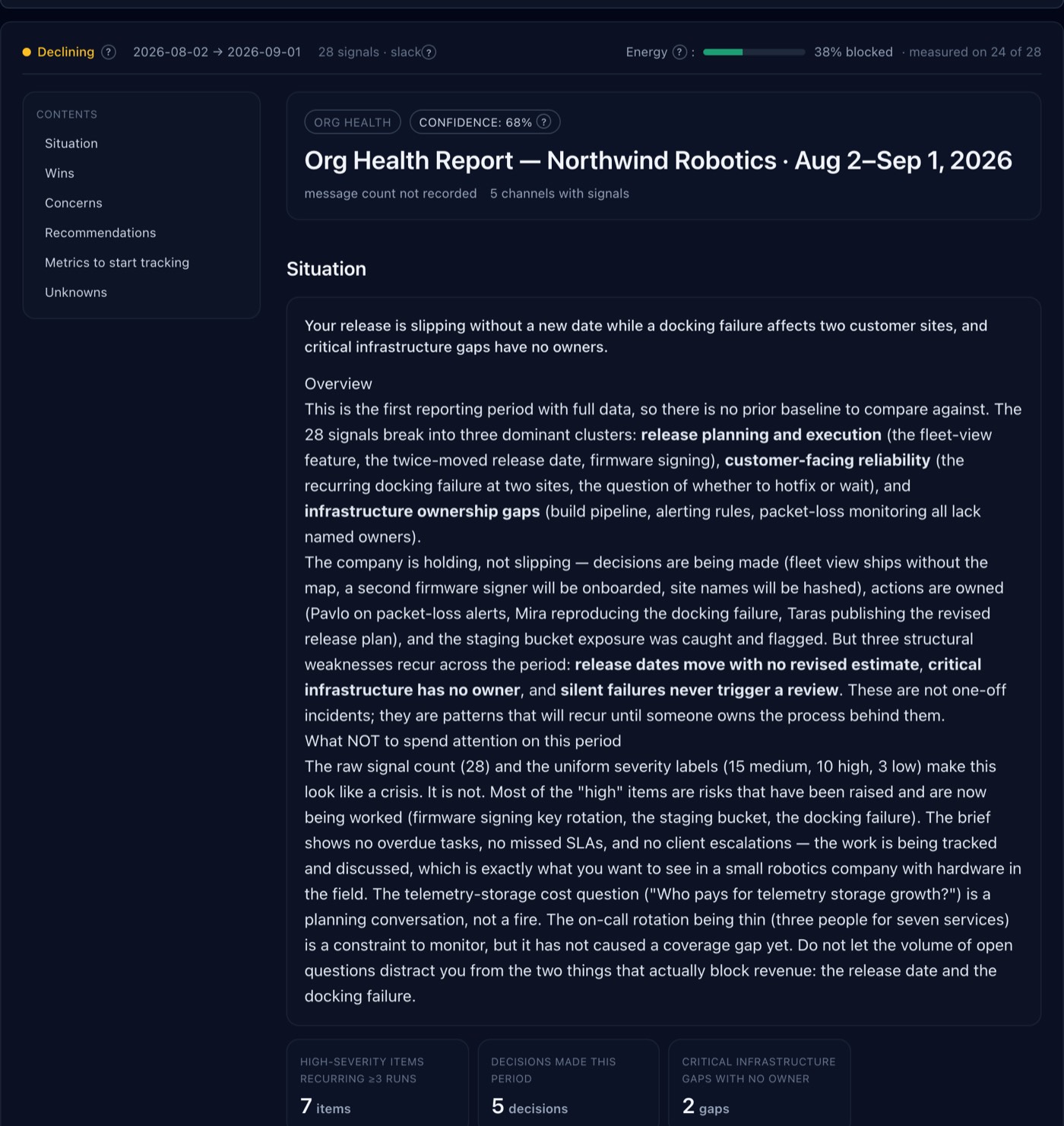
The Report tab is one document with a contents list: situation, wins, concerns, recommendations, metrics to start tracking, and what the report could not answer. Above it sits the read on the period as a whole — the direction of travel, the window, how many signals it covers, and how much of the team is blocked, with the base published beside the percentage so a figure taken from a handful of items is never mistaken for a verdict on hundreds.
The memo states its own confidence in its header, and it opens by saying which clusters the period actually broke into rather than restating the list. It then does the thing most tools will not: it names what not to spend attention on. "The raw signal count and the uniform severity labels make this look like a crisis. It is not." A report that only ever escalates is a report a manager learns to skim.
Under the narrative sit the counts that support it — high-severity items recurring across three or more runs, decisions closed this period, infrastructure gaps with no owner. Every one is arithmetic over the tracked items, not a number the model chose.
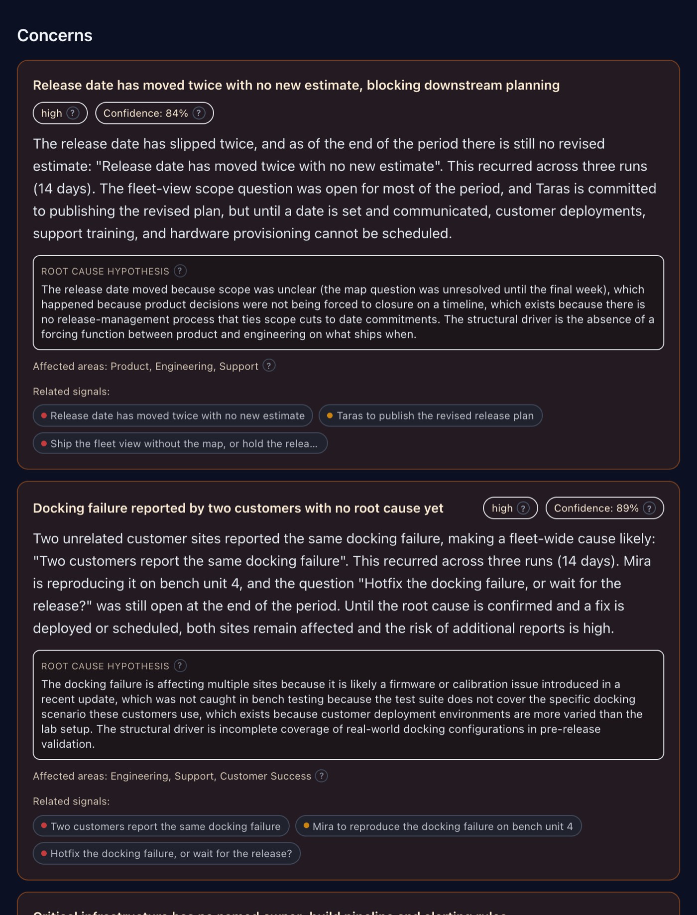
Every concern carries its root cause and its evidence
A concern is not a bullet. Each one states the problem in the team's own quoted words, says how long it has been recurring and across how many runs, and carries its own severity and confidence figure.
Then the part that makes it usable: a root cause hypothesis written as a chain — this happened because that, which happens because of this structural thing — followed by the areas it touches and the signal chips it was built from. Click a chip and you are back at the extracted item and the message behind it. Nothing in the memo is a claim you have to take on trust.
Recommendations that name the owner, the effort and the outcome
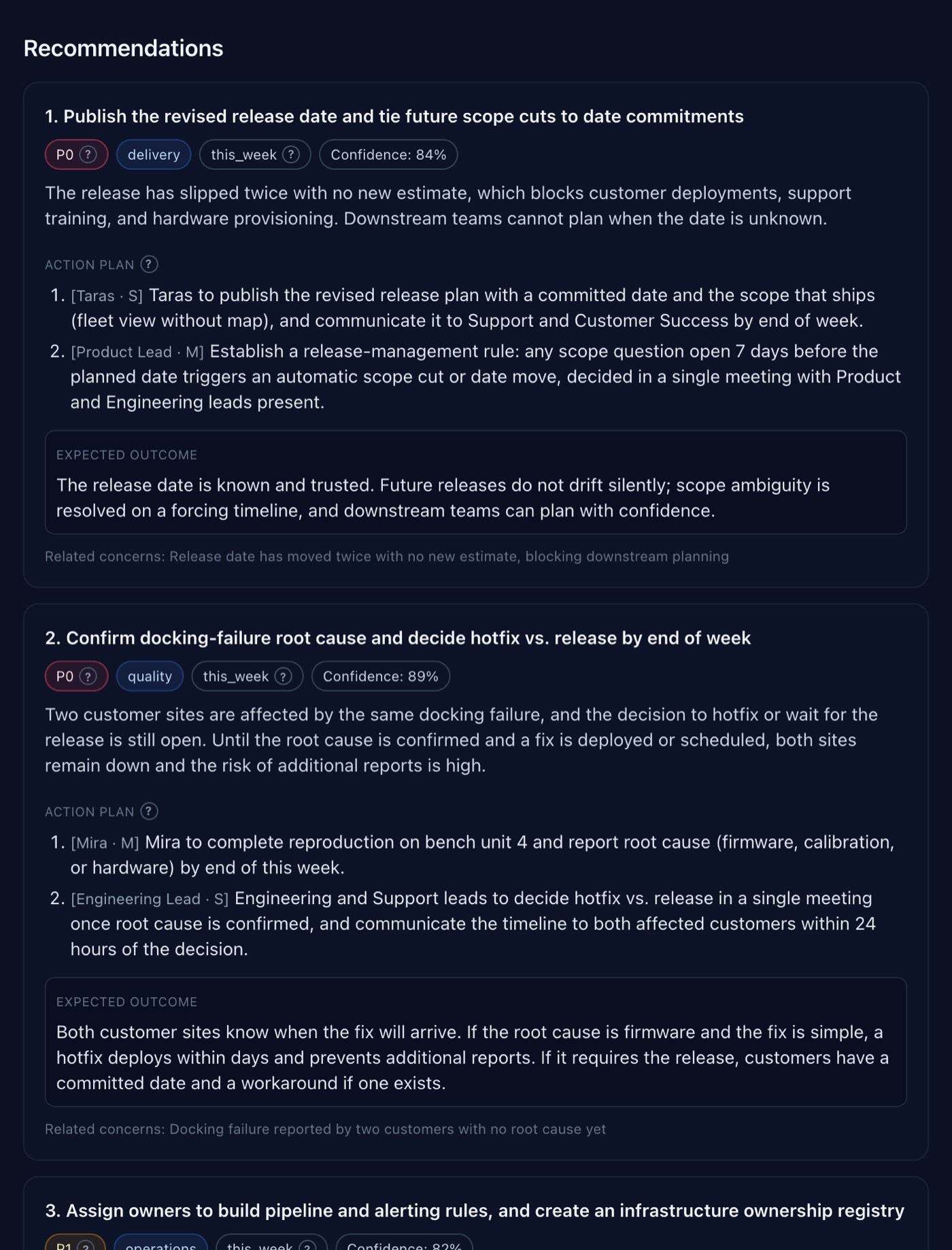
Recommendations are prioritised P0 to P2, tagged with the area they affect and how soon they would bite, and each carries an action plan whose steps are labelled with who does them and how big the step is — [Taras · S], [Product Lead · M]. A recommendation nobody can hand to a person is a recommendation that does not happen.
Each one also states its expected outcome, which is what makes it checkable next month, and links back to the concerns it answers. Below them the report proposes the metrics worth starting to track — current value, target, direction, cadence and where the number would come from — and then admits what it does not know: open questions, why each matters, and how to find out.
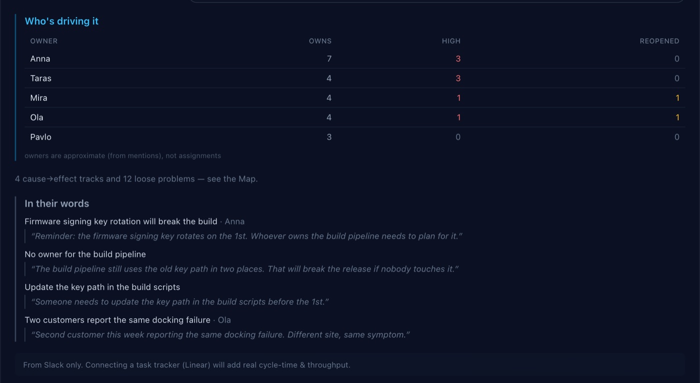
Who is carrying it, and the team's own words
Who is driving it counts, per person, how many problems they own, how many are high severity and how many have been reopened — with the caveat printed under the table that owners are inferred from mentions and are not assignments. A workload view that pretends to be a performance record is worse than none, so this one says what it is.
Last comes in their words: the problems quoted verbatim from the messages they were extracted from. Not a paraphrase, not a generated sentence — the line somebody actually typed. It is the fastest way for a manager to recognise a problem they half-remember, and the hardest thing for a summariser to fake.
And when a report has a predecessor, the page adds a line per recommendation the last one made, showing the metric it told you to watch, its value then and now, and whether it is working, worse, or not yet comparable because the earlier report counted a different population. Advice nobody checks is advice nobody follows.
Map — ranked by priority, not by date
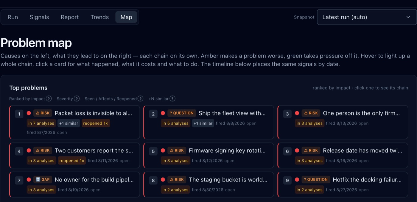
The Signals tab is ordered for triage. The Map is ordered by what a problem costs: how many days it has been live, how many people it touches, and how many other problems it holds up.
Each card carries those counts — holds up 1, reopened 1×, +1 similar where two near-duplicate problems have been folded into one — and the header says how much of the picture you are looking at: nine of twenty-five, with the rest one click away. That is the number to bring to a meeting: not "this is bad" but "this one is blocking another and has already come back once".
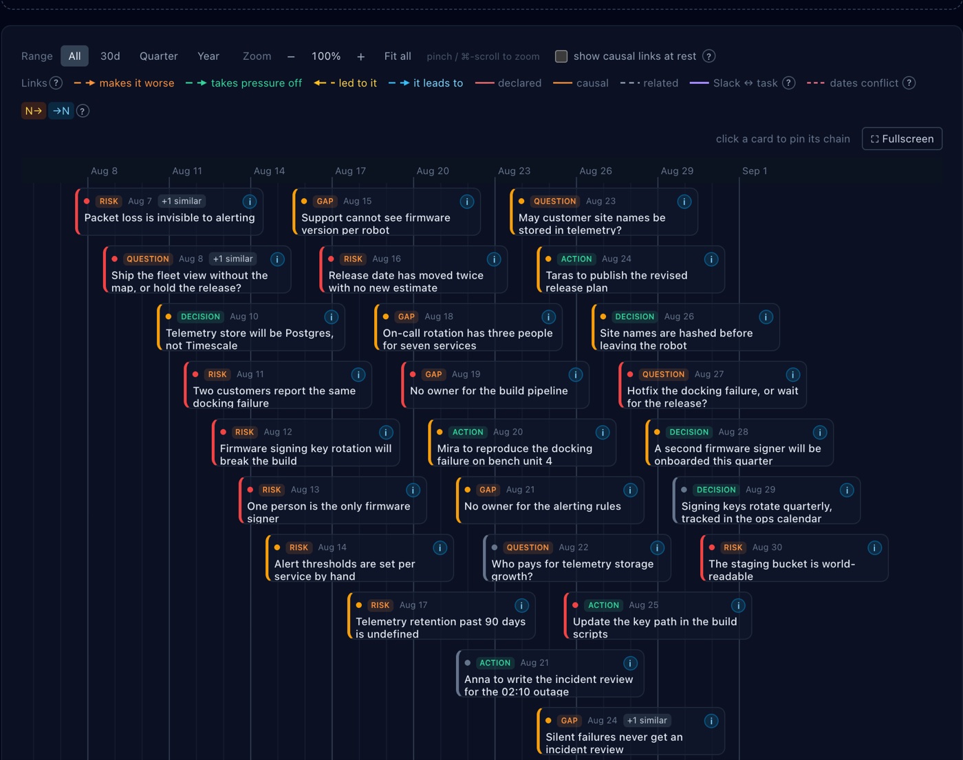
And the same problems, placed on a calendar
Under the ranking, every signal is laid out on a timeline by the day it was discussed, coloured by kind, zoomable from thirty days out to a year. That is what turns "we keep having alerting problems" into a row of dated cards you can point at — and it is why the Map is the screen people open when they have to explain a quarter to somebody who was not in the channels.
Where two problems are genuinely linked, the map draws the chain: the cause on the left, what it leads to on the right, with the relationship typed rather than a vague "related". And where no such link was found, the screen says so plainly instead of drawing a graph. That is deliberate. An empty canvas reads as a finding about the team; the truth may simply be that we did not extract a connection, and the product is required to tell those two apart.
Arithmetic first, model second
The obvious way to build this is to feed a month of messages to a language model and ask for a summary. It demos beautifully and it is unreliable in exactly the way that matters — quietly, on the details, in a way you only notice when you have acted on one.
So the work is split. A deterministic layer does everything that is arithmetic: which messages are new since the last run, which mention belongs to which problem, how many separate days it has come up, what is still open, what changed since the previous report, and the whole priority ranking behind the Map. The model gets one job — reading the already-linked signals and writing the memo — and every number it prints beside its prose was computed before it was called.
The practical effect is that the counts are right even when an interpretation needs a second look. And when the memo has not been generated at all, the page does not go blank or quietly present less: it says the narrative is missing and shows the computed read underneath, labelled as exactly that. The dangerous failure for a tool like this is not an error message — it is a report that renders perfectly and is missing things. Every run is completed, failed or cancelled and accounted for, the totals have to add up, and a degraded run never advances the point in history the next run starts from.
Connecting a tool to a company's chat is a serious ask
It means the tool can see, in principle, everything the company says. That shapes the whole design: a connection is scoped to the channels you select rather than the workspace, access tokens are encrypted at rest, and each company is a hard scope boundary enforced in the database rather than by remembering to add a WHERE clause.
The model is your own. SignalOps does not resell inference: you connect your provider key, and the product refuses to run rather than quietly billing anyone else's account. The legal surface — terms, privacy, sub-processors, refunds — is reachable without logging in, which is what a payments reviewer and a cautious buyer both need. The product is free to use and asks for no card, which is the honest arrangement for something that has to be pointed at real conversations before anybody can tell whether it earns its place.
Who it is actually for
The person this is built for runs several workstreams they do not personally execute. A team lead with four engineers and two channels. A founder who is in every conversation and present in none of them. An agency account manager whose clients each have their own shared channel.
What they share is that the cost of missing something is high and the time to scroll for it is zero. They do not need a better search box, because searching requires already knowing what you are looking for — and the expensive misses are exactly the ones you did not know to look for.
It is less useful to a team of three sitting in one room, and useless if the real decisions happen somewhere the tool cannot read. That is worth saying plainly: a product that claims to suit everybody is describing nobody.
At a glance
- Live at
- signalops.one · app at app.signalops.one
- Reads
- Slack · Microsoft Teams · Discord · Jira · Linear
- Extracts
- Decisions · actions · risks · questions · gaps, each linked to its source message
- Three screens
- Signals — the list · Report — the memo · Map — ranked and dated
- The memo
- Situation · wins · concerns with root causes · recommendations with action plans · metrics · unknowns
- Identity
- A canonical key per item, so the same risk across runs is one thing seen many times
- Approach
- Deterministic tracking, counting and ranking first, then one model pass for the narrative
- Your own model
- Bring your provider key; the product refuses to run rather than bill someone else
- Export
- JSON · CSV, on the filtered list
- Stack
- Next.js · Prisma · PostgreSQL · Claude API · Paddle
- Languages
- 10
- Price
- Free to use, no card
Questions people actually ask
What are the three screens?
Signals is every extracted item with its badges, filters and source messages. Report is the memo: situation, wins, concerns with root-cause hypotheses, prioritised recommendations with action plans, metrics to start tracking, and what the report could not answer. Map ranks the same problems by priority and places them on a calendar.
Is the report on this page real, or a mock-up?
Real. The company is invented, but the analysis was run through the product and the memo was written by the model reading those invented messages. Nothing on this page was typed into a screenshot by hand.
Does it read every channel in our workspace?
No. Connections are scoped to the channels you select, and access tokens are stored encrypted.
How is this different from asking an AI to summarise a channel?
The bookkeeping — what is new, what belongs to what, how often it has recurred, what is still open, how problems rank — is computed rather than generated. The model reads the already-linked signals and writes the memo; every number beside its prose was calculated before it was called.
Can I check where a decision came from?
Yes. Every extracted item links back to the messages it was taken from, every concern in the memo carries the signal chips it was built from, and the report quotes the team verbatim rather than paraphrasing.
Whose model does it use?
Yours. You connect your own provider key, and the product refuses to run rather than quietly billing another account.
What does it cost?
Nothing, and it does not ask for a card. It has to be pointed at real history before anyone can judge whether it earns its place.
 MSGView
 PubOpener
 Complevia